Hyper-casual games have become the golden goose in the mobile game industry over the last couple of years. Although the committed fans of strategy and action categories would look down on the simple graphics and easy-to-play logic of these games, there is one indisputable fact: hyper-casual games are insanely popular and they are likely to continue to be downloaded all around the world.
Why So Successful?
So what made them a huge success? At first glance, these games don’t seem to have much to offer. There is no thrilling scenario that will urge you to move forward and complete the game as soon as possible nor are there any compelling visual graphs and design. In fact, all hyper-casual games have a very simple UI and aim to deliver an easily adaptable UX for anyone. The only purpose is to tap on the right place at the right time, which makes these games relatively easy to play and get addicted to. Not to mention they target the largest possible audience with their generic design that makes localization unnecessary. And all these features make up the main reason why they are played by the masses.
Although certain characteristics of hyper-casual games such as being instantly replayable with short rounds and simple instructions have made them addictive, the secret of their success is not that clear cut. Like many other successful games, these games have also invested heavily in in-app ads and applied ASO tactics to increase their visibility. Without a smart UA strategy combined with savvy ASO practices, breaking into the top 10 apps in any category would only be a pleasant dream.
To uncover the ad strategy behind this hyper-casual trend, we have made an in-depth ad analysis based on the hyper-casual games of three industry giants: Voodoo, SayGames, and Good Job Games. In this report, we will compare the ad data of iOS and Android versions of their apps and examine the approaches of each publisher in detail. If you’re a game publisher who’s in need of a push to kickstart your game’s growth, you’re in the right place! Read on to see how the Masters of Hyper-Casual Games are acing it.
The Games Analyzed
We picked the high-performing hyper-casual games of these three publishers to give you a more fruitful analysis. Here is the list of apps:

App Store vs. Google Play Store
So, let’s get started from the comparison of the campaign metrics of iOS and Android versions of the above apps. We’ve detected some distinctive patterns between the strategies followed for each store and summarized them below.
Average creative counts are higher in the App Store

We’ve checked the total creative count and active creative counts of each and every app above. Conducting an analysis, we’ve detected higher numbers for iOS apps in general. The average number of total creatives is 65.5% higher while the average active creative count is 47.6% higher in the App Store. This result clearly shows that the competition is harsher for iOS apps, and publishers aggressively try to come up with new creatives to stay on top.
Note: If terms such as “creative count” or “active creative” sound like words from a foreign language, you may want to read our post about the Campaign Analysis feature to get a more clear idea about these metrics and their definitions on our platform.
Active Creative / Total Creative ratio is higher in the Play Store

The graph above shows the average active creative/ total creative ratio for both platforms. Although the creative counts are higher for the apps in the App Store, Android apps have a higher active/ total creative ratio. This shows a more effective use of creatives and a higher number of app A/B testing per game in the Play Store.
Ad publisher counts are higher in the Play Store

App Store beats Play Store in the creative counts. But it seems that the average ad publisher count is 32% higher for Android apps. Since monetization of apps on the Play Store mainly relies on advertising, advertisers reach more apps to publish their ads. Hence, the publishers in the Play Store try to maximize their conversion rate, getting their ads published in as many apps as possible.
Video & Playable ads are preferred more in the App Store

As the main selling point of hyper-casual games is the experience and the joy of scoring better in each try, playable and video ads would be the best choices to let the audience get a taste of UX. Although all games use a number of playable and video ads, games in the App Store have 12% more of them than do Android apps.
OnPipe (SayGames) is the one with the highest playable ads share with 44.4% in the App Store and 42.1% in the Play Store. Color Saw 3D (Good Job Games) is the game with most video ads (82.2%) in the App Store while Clean Road (SayGames) took the lead in video ads (75.5%) for the Play Store.
Publisher Comparisons
As we got the high-level picture of the situation in the App Store and Play Store, let’s see how individual publishers are doing. We have compared these three publishers based on their campaign metrics to choose the champion among them. Now, we won’t be giving any spoilers here 🙂 So, keep on reading to find out the winner. The analysis here is based on the iOS apps since the App Store as a platform seems to be more competitive than Google Play Store according to our previous analysis.
Voodoo is the master of ad iterations

Voodoo has an average of 368 total creatives and 76 active creatives per app, making it the publisher who conducts the highest number of iterations and invests the most in their ads.
Good job Games is following Voodoo closely with an average of 360 total creatives and 47 active creatives per app. On the other hand, SayGames is the most conservative of all as their apps have an average of only 67 total creatives and 22 active ones.
Although Voodoo and Good Job Games have a close cut in the creative numbers, Voodoo has a higher active/total ratio (approximately 31%) and therefore, it is better at making an efficient use of creatives.
Similar creative types for Voodoo and Good Job Games

The choices of Voodoo and Good Job Games seem to be similar in ad creative types as well. Voodoo mostly used video type with an average share of 68%. Good Job Games also invested in video ads with an average share of 67.7% per app. The video ad ratio for SayGames is not that high as they tried to maintain a balance with playable ads and image ads. Still, they opted in for video ads for half of their creatives.
Overall, high ratios of video ads indicate a strong preference for video creatives in the hyper-casual category. Since the video ads are good at highlighting how the game is played, it is no surprise that major publishers utilize them.
Good Job Games has the highest ad publisher count

Good Job Games has the highest ad publisher count per app with approximately 2668 publishers. SayGames has less than half of that number. But the more surprising thing is that Voodoo has quite low publisher count. Considering how successful its apps are, it must have selected the right ad publishers to reach the most profitable audience.
Voodoo has the highest category rankings
Apart from the campaign metrics, we have also looked into the category rankings to see which of these publishers managed to get a higher average ranking in the Games Category of the App Store.

Although category rankings are a result of many factors, ASO being a major one, it can be a good hint to decide which publisher is doing better. Based on the category rankings of all 19 apps, the apps of Voodoo has an average rank of 40, which makes it the overall winner.
Now, we need to point out something important here: Considering the scale of Voodoo with a great number of creatives, it is expected that it got a higher ranking. Yet, SayGames seems to have done a better job than both Voodoo and Good Job Games with lower creative counts and deserves a thumbs up.
The highest-ranking app of each publisher in the Games category of the App Store are as follows:
- 2048 Balls 3D by Voodoo – 5th*
- Turbo Stars by SayGames – 15th*
- Fun Race 3D by Good Job Games – 31st*
*Data has been extracted on Dec.16.
The data up until this part has been compiled from our Ad Intelligence platform. If you wish to get more insights about different categories, contact us to get your free demo.
Now that we have an idea of the overall situation of these hyper-casual makers, let’s get into the category rankings, campaign, and creative details of the top hyper-casual apps listed above.
Category Rankings & Creative Analyses

Above you see the category ranking graph of 2048 Balls 3D, Turbo Stars, and Fun Race 3D for the Games category in the U.S. Since Fun Race 3D was released on May 5th, 2019, we set our time window as May 1st, 2019 – December 13th, 2019. Do you see the steep increases in the timeline? We’re also curious to know which creative took them from 1.5K to the top 10. So let’s see a summary of their campaign metrics and some of their creatives that led to this jump.
Campaign Analysis of Fun Race 3D
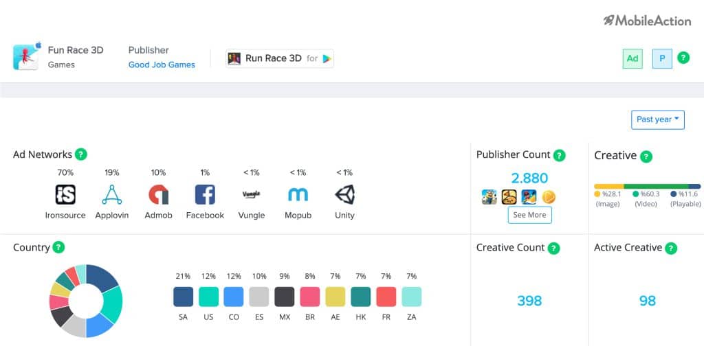
Fun Race 3D by Good Job Games has the earliest release date, so we started our analysis from this game. In the Campaign Analysis page, we have set the time interval as “past year” to see a comprehensive picture of their user acquisition efforts.
The first thing that grabbed our attention was the huge number of publishers and multiple ad networks. It seems that they aggressively try to maximize their reach to remain competitive. Their creative count is the highest among all three apps. Yet, considering that the game was released in early May, the numbers are reasonable.
After we sorted their creatives, we found out that Fun Race started its first ad campaign on June 2nd, using AdMob and Unity. The campaign was live in 36 countries for 88 days. As the jump in the rankings happened between May 26th and June 2nd, the creative below might be one of the sources of its success:
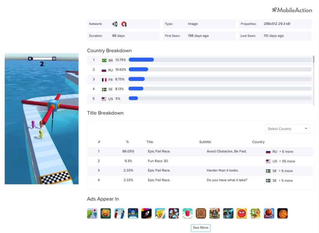
See the different subtitles used in different countries? As you might have already realized, there is one common point about them: They encourage the players to download the game by challenging them. And look at the titles that say “Epic Fail Race”! So it’s guaranteed that we’ll fail? Well… to be honest, it definitely makes us to give it a go 🙂
Campaign Analysis of 2048 Balls 3D
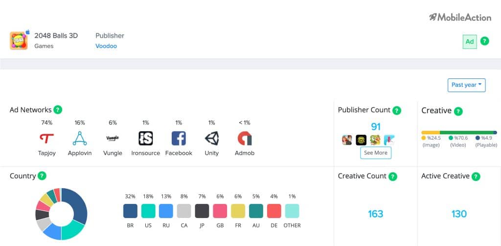
2048 Balls 3D was released by Voodoo on October 30, 2019. Although the concept of merging things of the power of 2 to reach 2048 is quite old, this game is a relatively new one in terms of the release dates compared to the other two. Naturally, it has a lower number of creatives compared to Fun Race 3D.
Voodoo seems to have opted in for video apps mostly, but it also uses images and playable ads just as effectively. Here’s an example of one of their active video creatives:
The video presents both the game’s purpose and functionality in a very clear manner. Also, the simplicity of the UI shown in the video is a typical example of a hyper-casual game and makes the users feel challenged, urging them to give it a shot. Overall, it’s a great example of an intriguing ad of a successful hyper-casual game.
Campaign Analysis of Turbo Stars
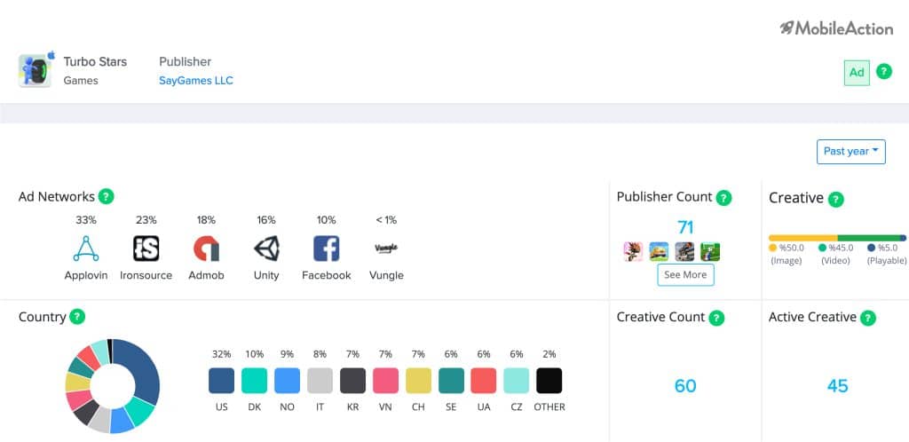
Published on September 29, 2019, Turbo Stars has become the star of SayGames in a month. 35% of its ads have been published on Applovin and Ironsource seems to be the second most used network. While 50% of the ads are images, they have also used videos a lot. The creative count remains on the lower end. Yet, the quality of those creatives are quite high. Just to give an example, take a look at the below creative which is the first video they made:
Hypnotizing, isn’t it? They’ve made good use of their UI and did a good job showing us a glimpse of their UX. Subway Surfer fans may remember how addictive this type of 3D UI can be, and anyone watching this video will most probably assume that this game might be the absolute cure for boredom.
Speaking of the attractiveness of the UI, Turbo Stars has done a good job of publishing a playable creative to let the users experience how it feels like to play their game. We have tried to play it on our platform as well 🙂
Overall, hyper-casual games are all about simplicity and the ease of UX. Once you can get users to try your game, assuming that you provide a good user experience with a nice UI, those users are likely to stay with you for a long time and hopefully make some in-app purchases to rank higher.
Takeaways from Ad Practices of Hyper-Casual Games
- Use both videos and playable ads to show the UI and UX.
- Conduct mobile app A/B testing with many different creatives to find the best one.
- Make users feel challenged with good titles and subtitles – check the best practices to get some inspiration.
- Have the relevant ad publishers publish the ads (try another hyper-casual game if possible, as you would be targeting a similar user-base).
- Make your ad title/subtitles intriguing and challenging to convince users to try your game.
Hope you enjoyed reading our report. The data we used in this ad analysis comes from the Ad Intelligence product of MobileAction where you can find any campaign or creative information you need to level up your app’s ad strategy and boost paid growth. You can do a similar analysis for any app or category you like to build a killer UA strategy. Contact us to discuss your data needs and learn about how we can help you.
Schedule a demo with us to start using Ad Intelligence!
