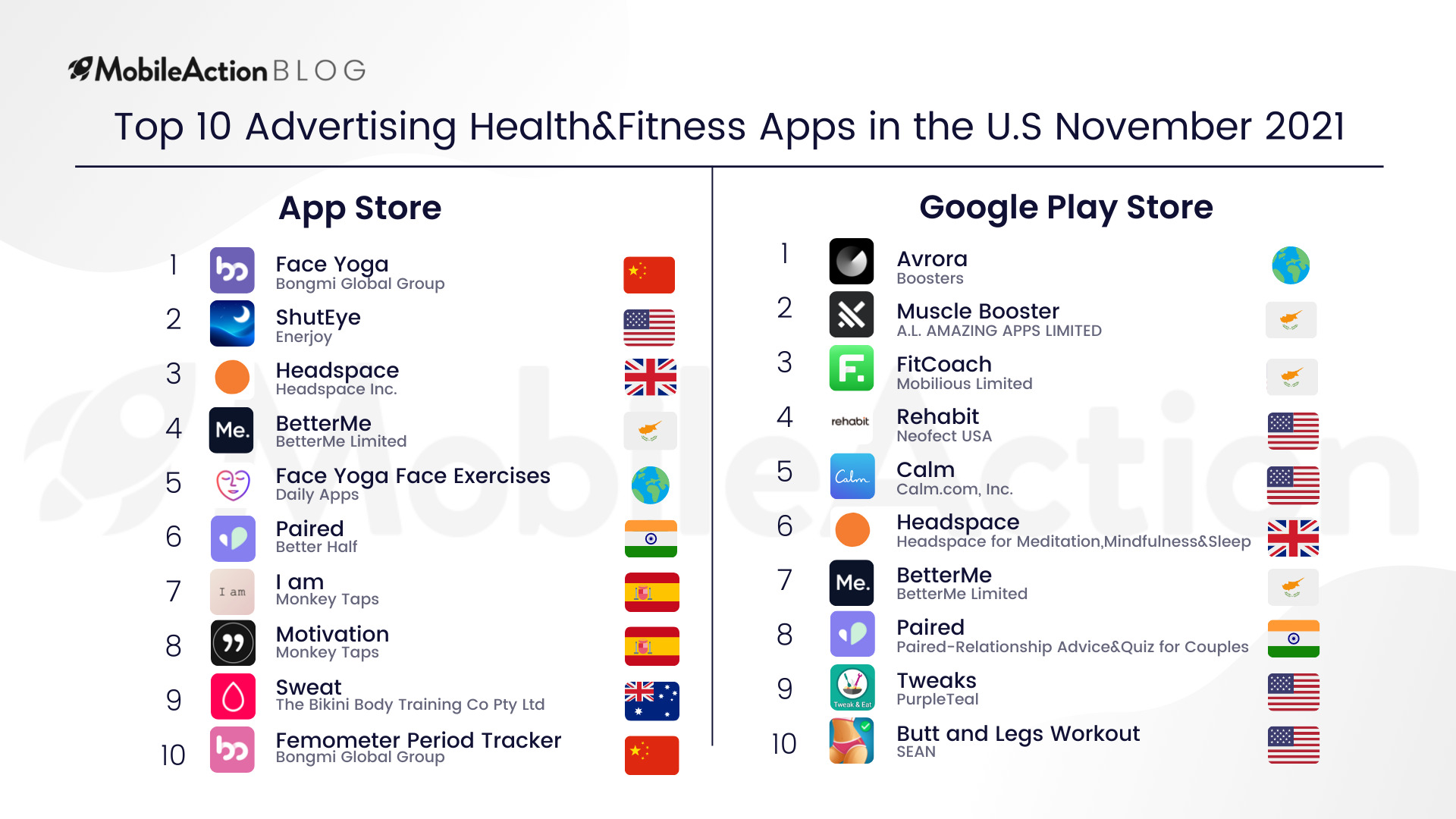
We all know that the greatest wealth is health, and without paid advertising, we would never come into contact with some of the most amazing Health & Fitness apps out there. In this article, we are going to take a look at the user acquisition strategies of the Top 10 Advertising Health and Fitness apps in the U.S for November 2021.
Health and Fitness is the upper chord of many subcategories from workout apps to meditation apps to even apps for better sleep. As you can see, there is also a wide variety of apps in our top 10 advertising Health and Fitness Apps for November 2021. Moreover, the top advertisers in the App Store differentiate from the top advertisers in Google Play. Only three apps found a spot for themselves in both app stores: HeadSpace, Paired, and BetterMe.
This tells us that in the Health and Fitness category, apps hold diversified approaches for app stores. While Face Yoga by Bongmi Global aggressively pursues paid marketing in the App Store and runs ten times more unique ad creatives than their closest rival, they are not even in the top 10 in Google Play.
Meaning, Face Yoga by Bongmi Global decided that they need to focus more on the App Store for their growth. This can vary from one app to another and totally depends on the marketing goals of the app.
Let’s take a closer look at the strategies of some of these top advertising health and fitness apps by analyzing BetterMe, Paired, and Headspace.
BetterMe: Mental Health
BetterMe is an app that aims to improve mental health by providing breathing exercises, relaxing sounds, and more. In short, their promise is to relieve stress. Strangely, they are reaching out to users on social media platforms where most studies point to as the cause of stress.

Know your audience, right? If you were selling sunscreens, Greenland wouldn’t be in your focus. Not yet at least. You would have preferred hot locations where people need sunscreens. Similarly, promoting a stress relief app on platforms where people need it should benefit your marketing goals.

Their ad creatives get impressions mostly in the United States and Japan. Although they have a huge total share in European countries where English is not the main language, their CTOs, title, and Subtitles seem to remain unlocalized. As we pointed out several times, localization helps you to connect with users on a deeper level. In this way, you can understand and respond to their needs better. But more importantly, you can make them understand you better, which will increase your app downloads and reduce your user acquisition costs in different regions.
Creative Analysis
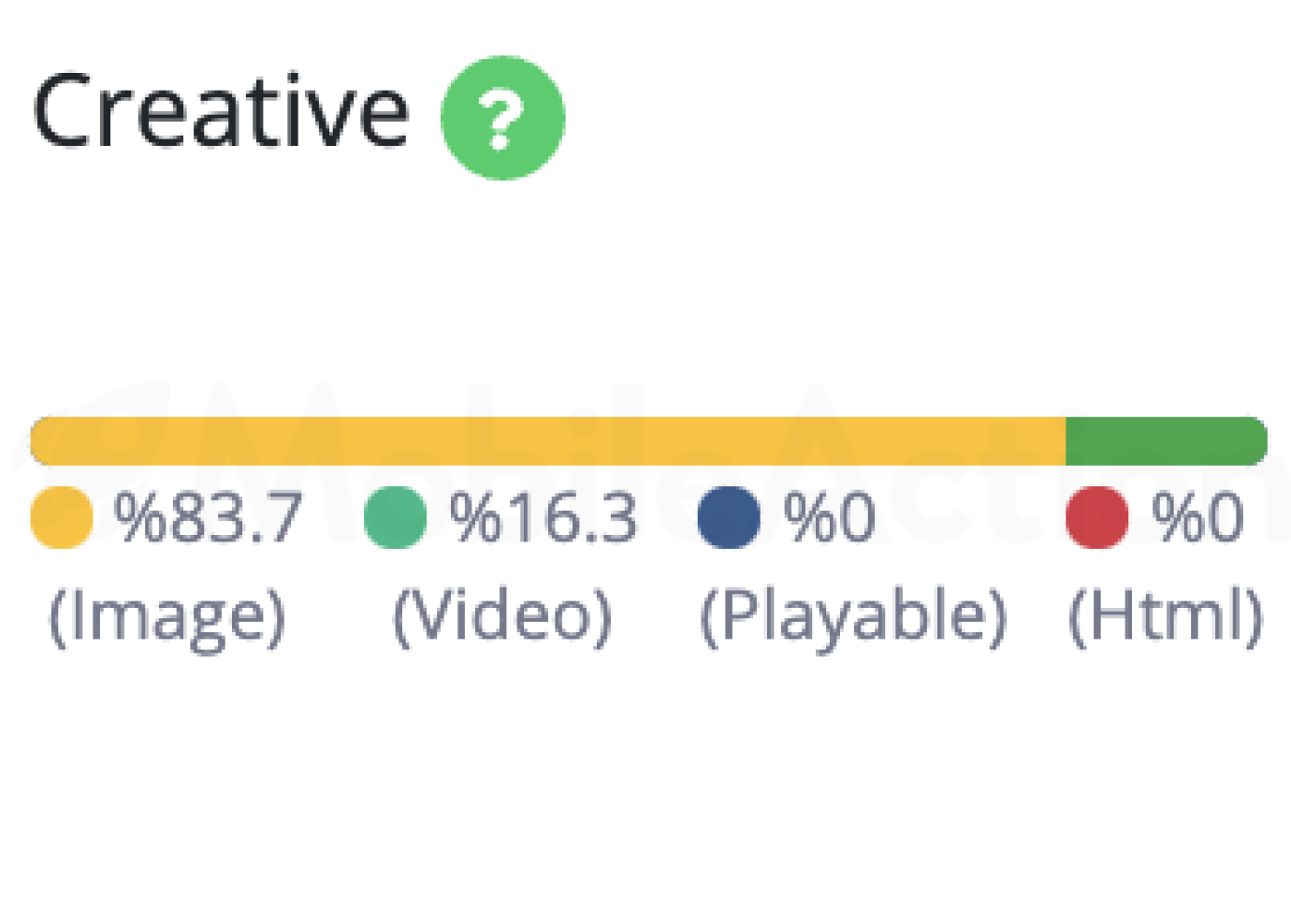
They are heavily running ads in the image format. So, let’s start with them.

These are the image ad creatives of BetterMe in order of impression scores. As you can see, they have several different subjects and methods to engage with users. However, the most salient aspect is how they present the same subject on different canvases.
If you look closely, you’ll see, they’re using not one but four different designs for ad creative on Childhood Trauma. Different colors, different elements, different schematization but the same content. Without A/B testing, you cannot know which design will work better with users. And as seen, BetterMe is working to improve their ad creatives by benefiting from it.
Now let’s take a look at their video ad creatives.
This is one of the best-performing video ad creatives of BetterMe. In this short video, we have seen the user interface and their approach to the subject of fitness. They showed that they benefited from Neurofitness and offered different courses, exercises, and meditation techniques to improve mental health. All in just 18 seconds.
Here, we see a different approach. They start by identifying the problem and close it up with a solution. In other words, they say: “If you have these signs, you might have depression but don’t worry. BetterMe can help you.” In a sense, we can see a similar approach as hyper-casual games, which use provocative titles in their video ads. Instead of ‘You Will Not Pass this Level’, advertising health and fitness apps apparently use depression and similar themes.
For the best results, you, too, should elaborate your ad creatives with different approaches. Remember, you are dealing with tons of distinct users. You can only engage them with a comprehensive ad campaign that reflects many subjects related to your app.
Paired: Couples and Relationships
Here, we have another stress-relieving app that ranks among the top advertising health and fitness apps. However, Paired focuses on a more specialized subject. Relationships. It is a tough subject to deal with even if you don’t have one but most people have problems in their relationships and they are looking for ways to solve them. Paired shoulders the responsibility.
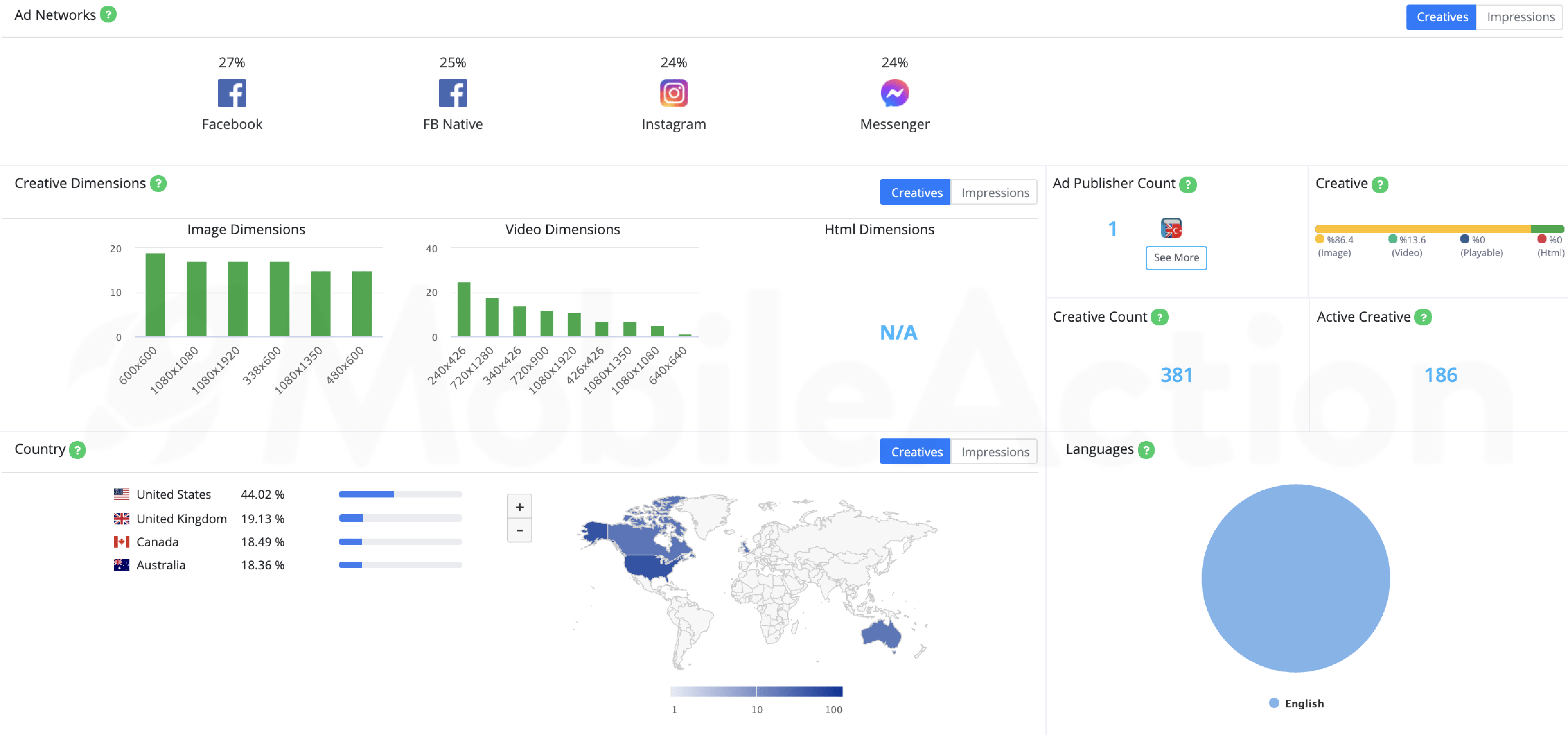
As you can see, they are also targeting social media users. Their main ad creative format is the image and just like BetterMe, they only run ads in English. However, the crucial part is that Paired runs these ads in countries where English is the mother tongue.
You don’t have to target everywhere but you have to target everyone in your focal in the right way. Paired could have aimed for a lot more countries but they preferred to focus on four countries and engage better with them. However, you should know that language is not the only aspect of localization. Although they all speak English, these four countries have different cultures. For a better approach, you should tailor your ad creatives to these cultures.
So let’s see how Paired did.
Creative Analysis
Let’s define what a good ad creative is. It should be catchy and intriguing while showcasing what your app is about, right?
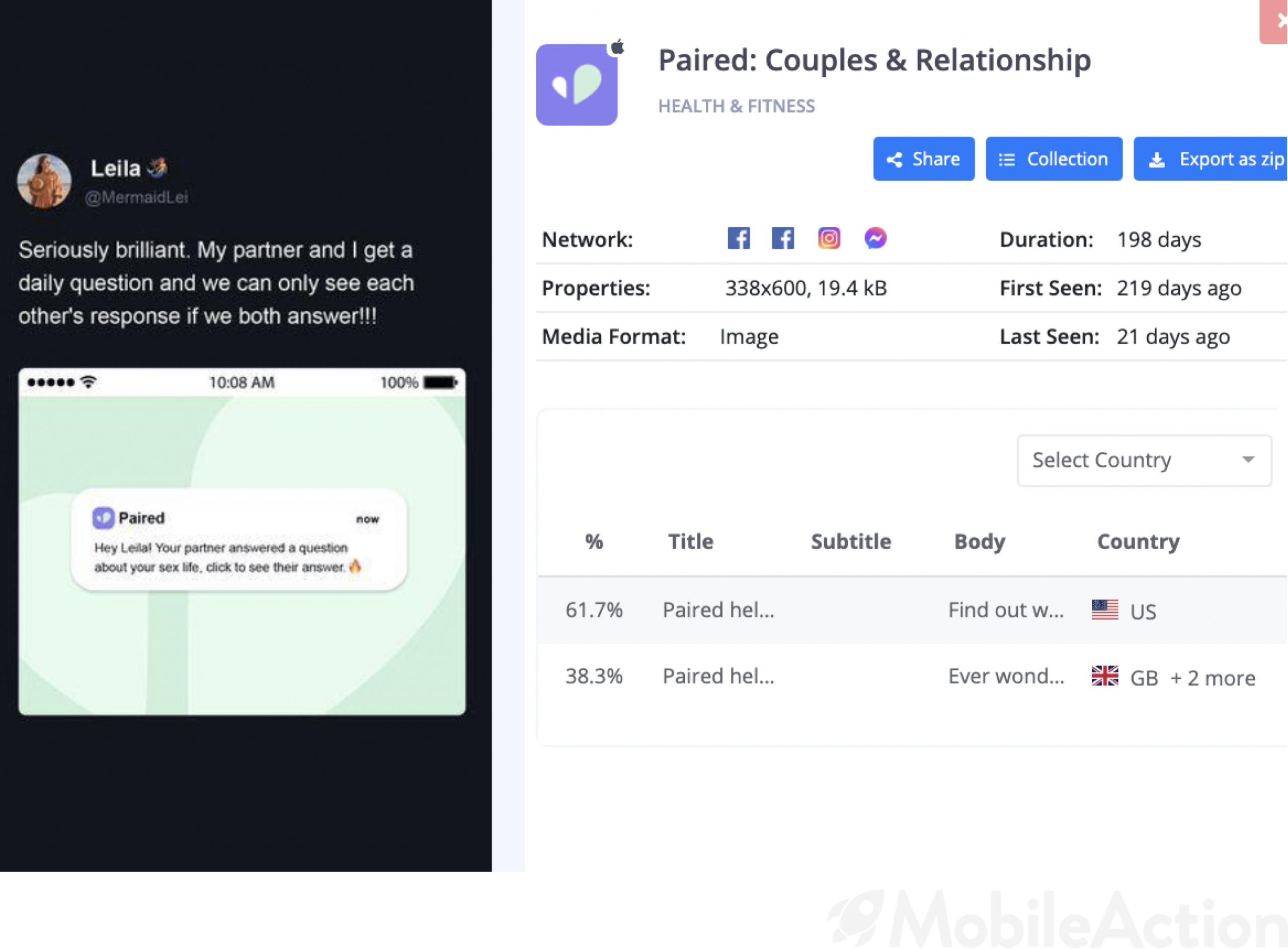
Here is an example. A simple notification from the app followed by a tweet that talks about how the app works. Seriously simple but seriously brilliant.
In this video ad creative, we see the purpose of the app, which is nice to have in your ad creative. However, we don’t get the chance to see the user interface and the types of questions. Adding these elements will most likely benefit from increasing the click-through rates. Thus, users will have a better understanding of the app and therefore be one step closer to the download button.
Apple Search Ads
BetterMe wasn’t running Apple Search Ads and it is definitely an obstacle for their marketing goals. However, Paired did not fall into this error. Below, we see the best-performing Apple Search Ads keywords of Paired.
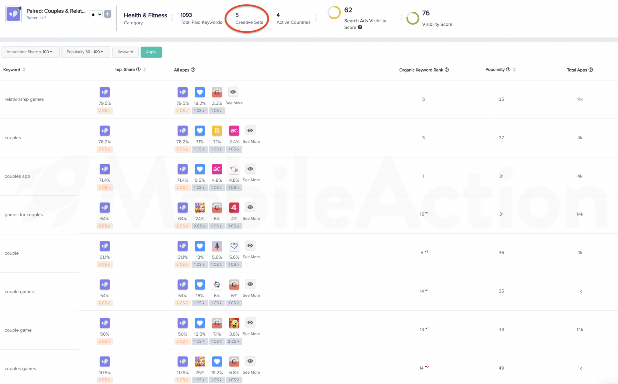
As you can see, the popularity scores of the keywords are good and Paired gets the lion-share in these keywords. But what’s better is that they are benefiting from 5Creative sets.
Product Page Optimization and Custom Product Pages became live on App Store Connect as of yesterday. As you know, Custom Product Pages have replaced the Creative Sets feature on Apple Search Ads where you target different users with different product pages.

Above, we see two custom creative sets for Paired. They group different keywords that reflect the chosen creative assets. In the first one, the screenshot says challenge your partner with couple games. And on the right, we see that Paired utilizes keywords like “Relationship Games”, or “Couple Games” for this creative set.
In the second one, the screenshot says track your relationship health. And for this creative set, Paired utilizes keywords like “Couple Therapy”, “Relationship Counter” or “Relationship Advices”.
Why is this a better way of advertising? Because the one that searches for a couple’s game might not want an app that will question the relationship. And, the one that looks for ways to save the relationship wouldn’t have been interested in games. Meaning that there is no one-size-fits-all in advertising. You have to diversify your content and engage with every user.
Headspace: Mindful Meditation
You must all have heard of “Success comes before work only in the dictionary.” And only in the dictionary, comes stress after meditation. Headspace offers hundreds of guided meditations to help you let go of your stress and anxiety.
But we are here to see what their paid user acquisition strategies offer to them. So let’s begin.

Our beloved social media channels again dominate the ad networks. However, unlike the previous examples, Headspace also works with other ad networks like Admob, Ironsource, and Snapchat. Since some ad networks behave as DSPs, we see can see that Admob directed 6% of the creatives to Unity. Additionally, the creatives which were submitted through Liftoff seems to have appeared in Tapjoy and Mintegral.
Tracking your mobile ad creative’s journey and seeing which ad networks work better for your campaign can allow you to really understand which mobile ad networks perform the best fo your app.
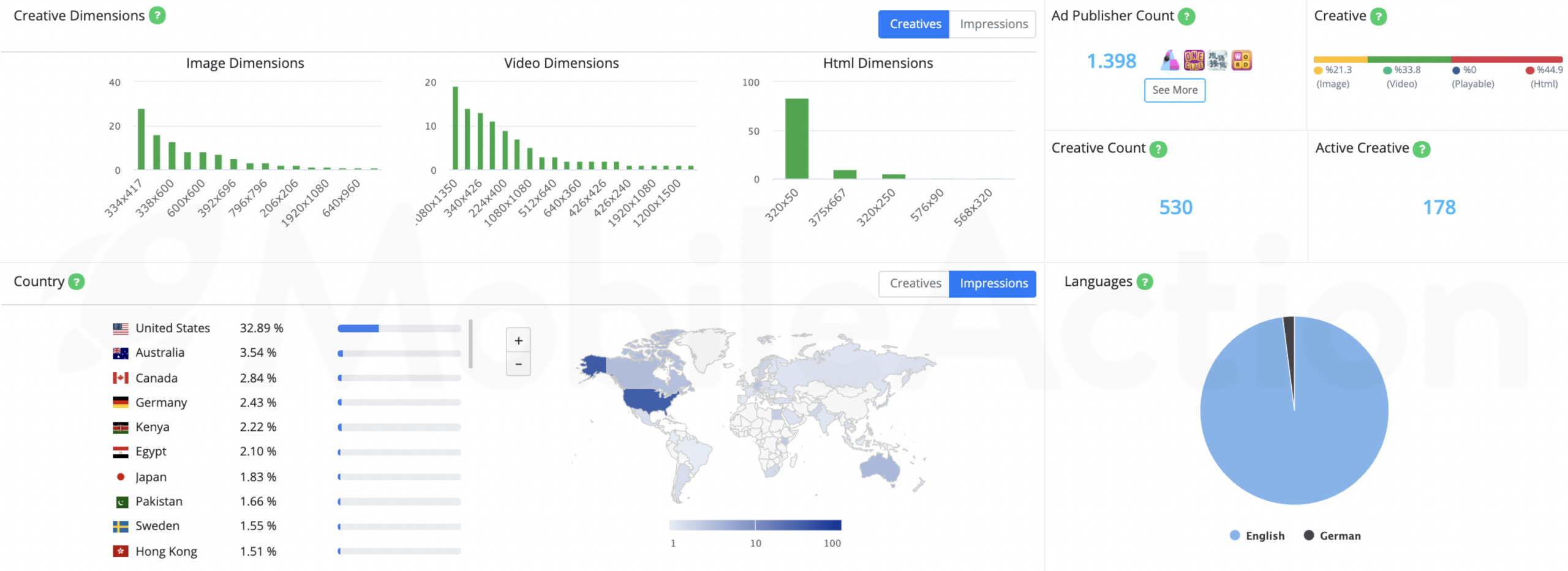
Headspace runs a large portion of ads in English and very little in German. Even though they get nearly 40% of impressions from English-speaking countries, the remaining 60% must still matter, right? However, they seem not to localize their CTOs, titles, and subtitles except for German.
For the previous examples, the image format was second to none. Headspace, however, favors the Html and Video formats more than the image. Let’s see whether they did a good job.
Creative Analysis
As mentioned above, the video format is heavily preferred by Headspace so let’s start with them.
The tone of the speaker, the sound, and the background, all was perfect to show that you can get a nice sleep with headspace. It’s always better to demonstrate what you can really do rather than talk about them. We can see that this creative fits in really well with what Headspace offers as a service as well as their brand positioning.
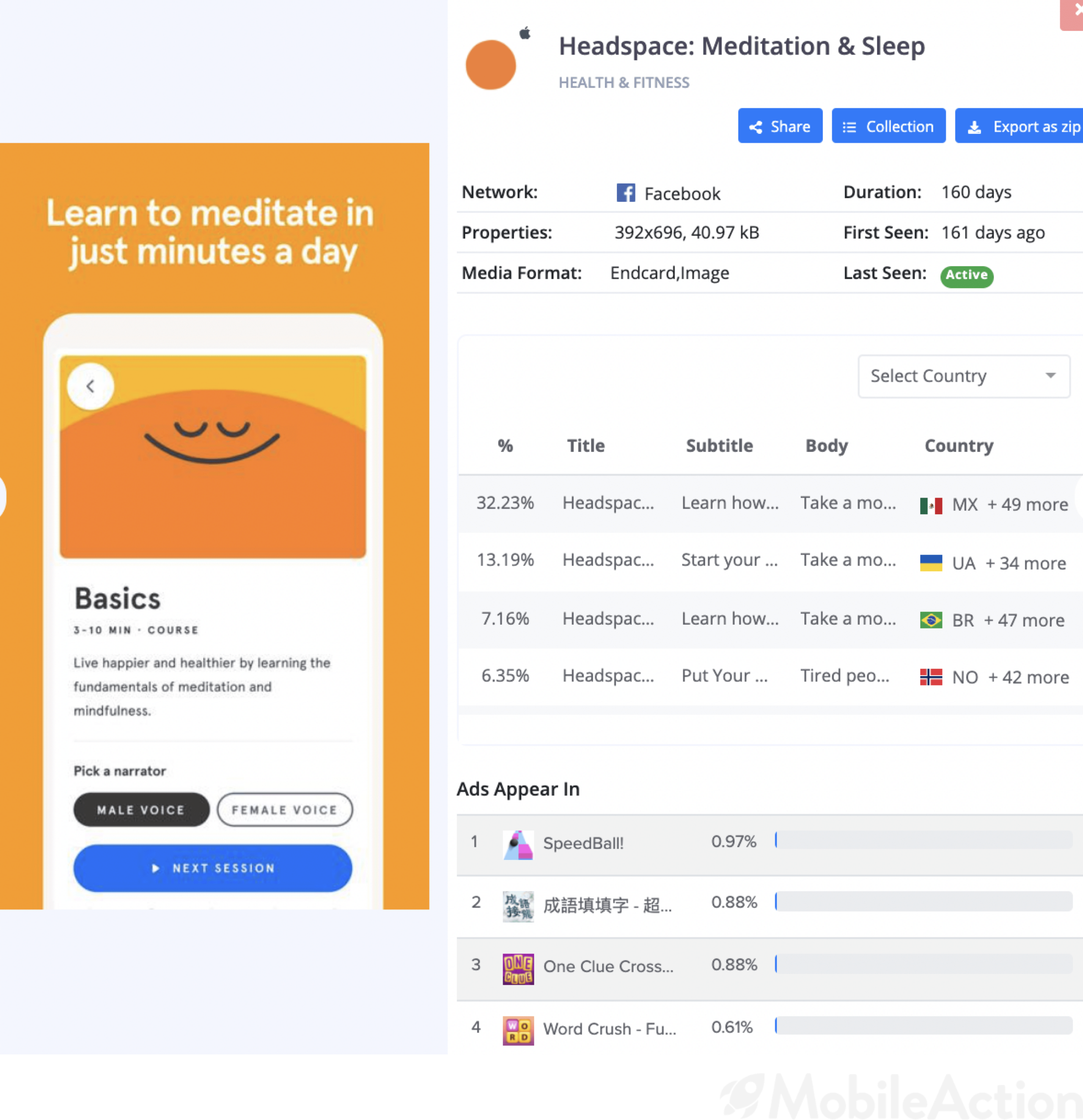
So, here is an image ad creative of Headspace. They simply showcase a feature of their app. Listening to relaxing sounds is one thing but you can also learn how to meditate with the help of Headspace.

What is Germany known for? Octoberfest, football, cars. Ad creatives of Headspace, especially localized for Germany, should be on that list. As mentioned above, they don’t do this for others.
If you are not proficient in German, this ad won’t make any sense to you. Just like English ads wouldn’t make any sense to the users who don’t understand English. That is why we always highlight the importance of localization.
By the way, the ad says “The best sleep you will ever have. Try it for free.”
Apple Search Ads

Headspace utilizes over 4k paid keywords in the U.S and runs Apple Search Ads in 30 countries, including Germany of course. They also have a total of 5 Creative sets which 2 of which are custom creative sets.
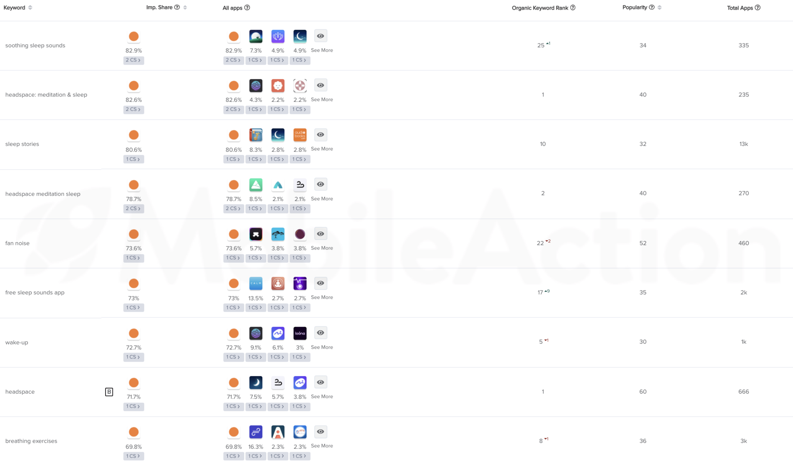
We have filtered the search for keywords with above 30 popularity and then ranked them by the impression share.
As you can see, Headspace has more than 70% of the impression shares for these highly popular keywords. It means that Headspace is doing a pretty good job of finding the right keywords and bidding the right amount.
Moreover, most of these are long-tail keywords. As you know, long-tail keywords have low search volume by definition since they become more specific with each keyword added. However, these keywords also have volumes. This means that they have the potential to increase conversion rates due to their specificity while reaching out to a large number of users.
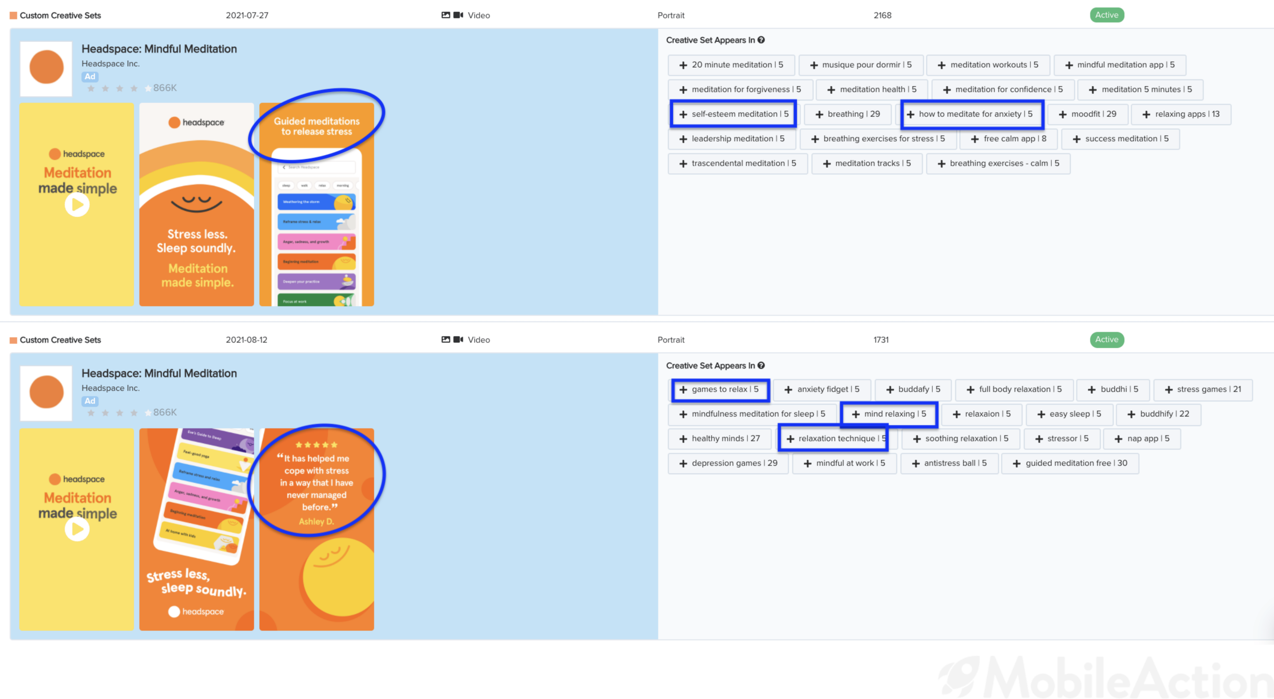
As you can see, Headspace is using two different sets of creative assets for two different sets of keywords. The first one focuses on the feature of “Guided Meditations”, the second focuses on the value proposition of stress-relieving. Different contexts require different approaches and this is what Apple Search Ads offers: The Ability to target each and every user in a more detailed way.
Our Ad Intelligence enables you to research the market, your competitors and make data-driven decisions for the maximum benefit. Schedule a demo with our experts now and get a taste of it but we warn you, you will really like it.
