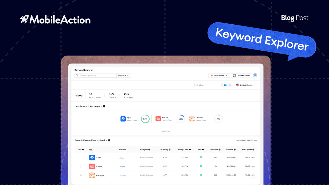
It’s been barely a month since we announced our last UI update of the dashboard, but here we are! Back again with a new look for one of our Keyword optimization pages.
We received a lot of positive feedback regarding our recent Keyword Suggestion update, so we decided to show some love in a similar fashion to our Keyword Explorer page. Here with a brand new look as well as some additional new key features, we believe a lot of you will be spending more time on this page.
Do remember, it’s your feedback and suggestions that help us plan our product roadmap and decide what to prioritize. So please don’t be shy when it comes to talking to the Mobile Action team. Come say “Hi” and share your ideas with us. Who knows, you might see your idea on the dashboard the next time you login!
The Old vs. The New
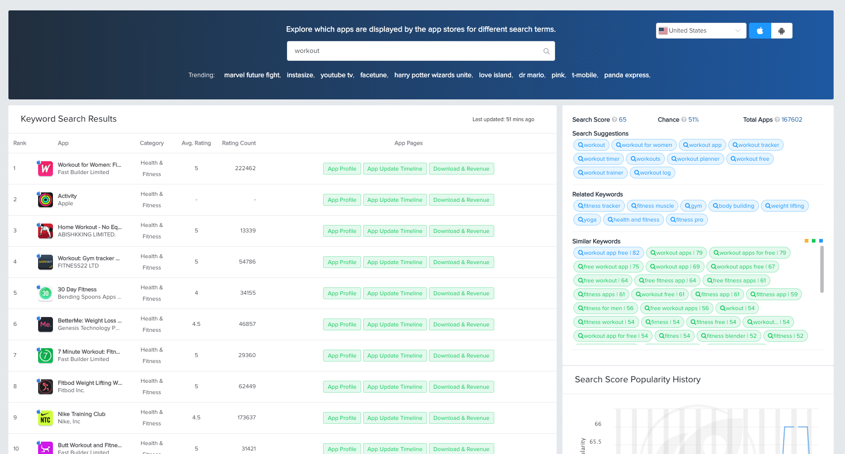
We found the that our old page could use some improvements in terms of both it’s design and functionality. Our thought process going into this update, was to first create a design that’s more simplified, user friendly, and easier to navigate. Having accomplished that, we felt that Keyword Explorer needed some added value in terms of its offerings.
UI & ASA Insight changes
As most of you are aware, this page was mainly used to discover which apps are ranking on a specific keyword. Similar to the search function of both app stores, we would display all apps ranking for a keyword of your choice. This was useful in case you wanted to see which apps were out-ranking yours, and whether or not they were competitors you were already aware of.
Don’t worry, this feature is still there as it was used by a lot of you. In addition to being able to view organic rankings on a keyword, we provided some inorganic rankings on this page too, via ‘Apple Search Ads Impression share’. We’ve kept this part of the page as well, but provided a more cleaner and simplified design.

You could also see the changes in the volume of a keyword on the right hand side of the page. This has been removed completely from the page, but you can still find this data on the ‘Keyword Tracking’ page, under ‘Keyword research’.
Keyword Suggestion Changes
We had recently added a new keyword suggestion called “Similar Keywords” to the old explorer page that went a little noticed amongst the other suggestions we were offering, as it blended in due to the old display.
This section has been completely revamped in terms of its UI and has become much more clear visually. We hope this change make’s this feature stand out a bit more and provides you ASO fanatics with even more ideas of some keywords to rank for.
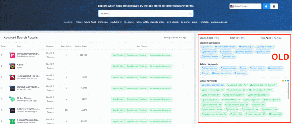
Similar keywords are provided using an algorithm we created in-house. You can read more about that feature and how it works here.
The Game Changer
The newest and most important addition however is the download and revenue estimations that we’ve decided to provide. In the past, when you would search for a keyword on this page, we would provide you with some insights for all the apps ranking on that keyword.
For example, you could see how many ratings they’ve received, the average rating, app category, etc. All of this is still available, with the addition of download and revenue numbers. Do note however, these numbers are estimations provided only for the previous day.
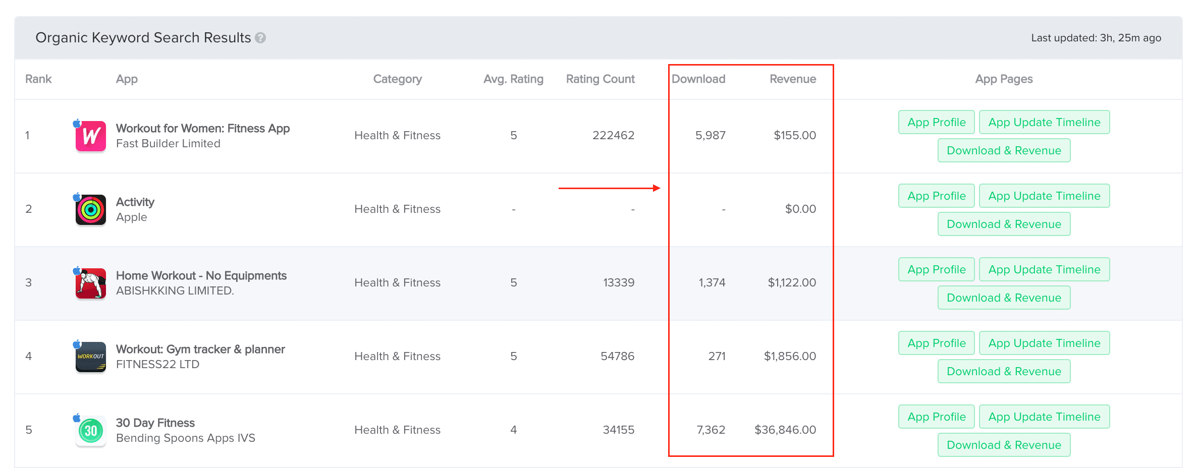
This is a huge game changer as we’ve never included any market data in our keyword features before. These numbers will provide you with deeper insight into the competition and give you an idea of how apps that rank higher than you, are performing in the market.
So that sums up part two of our UI update journey. Another page down, and many more to come soon. Stick with us as we’ve got a lot more planned for this Summer. In the meantime, head on over to our dashboard and give the new Keyword Explorer page a go.
– Mobile Action Team
