Olymp Trade is a Finance App that is 21st overall in advertising. This means that, within our Ad Intelligence tool, we have a tool that filters apps by their creative counts and impression scores.
These insights can be filtered according to various verticals like category, network, and country. This app is number 21 overall.
Finance apps, more specifically trading apps, and Game apps make up the majority of the top advertisers in terms of app categories these days. Each category of games has different types of creatives, but when we look at stock trading apps in the Ad Library, we can really see that we are in a whole new world.
Stock trading apps are used to buy and sell shares of stock. They may also allow you to make investments in other products. Let’s see what its advertising strategy is and see if we can take any pointers.
Campaign Analysis
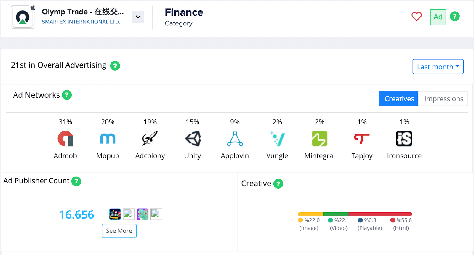
When we examine the app with our Campaign Analysis tool, we can see that they are advertising on 9 ad networks. predominantly Admob at the moment. We can also see that they have a publisher count of over 16,600. Additionally, they use video and image creatives almost equally and most of their creatives are HTML.
Their total creative count is larger than their active creative count. However, most of their creatives are currently active.
Location
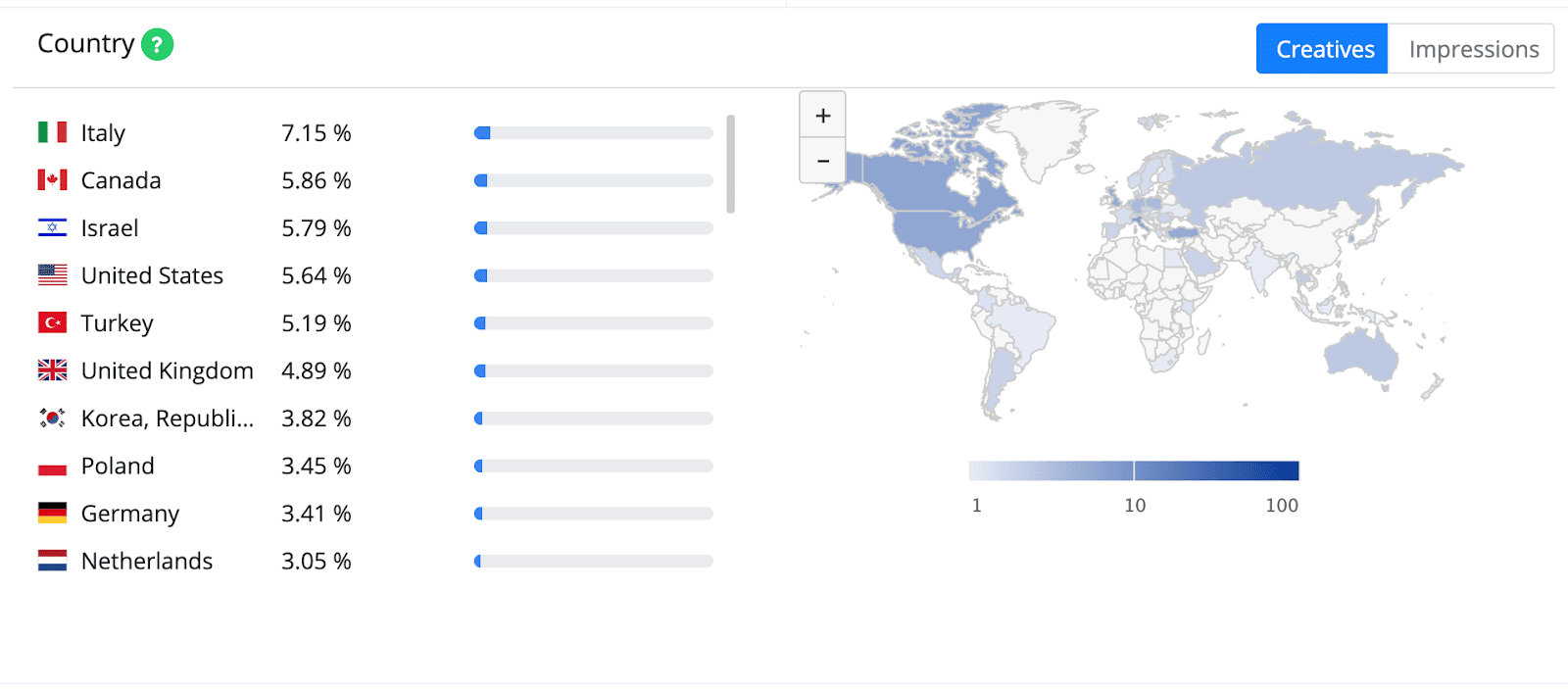
Olymp Trade does not focus their advertising in the United States, UK, or Australia, but rather Thailand, India, the Philippines, and Malaysia are their top 4 countries of focus.

When we compare this to Crypto.com, a competing app and the current top advertiser in the App Store, we can see that they have somewhat gone after opposite locations. In fact, there is no overlap in their top advertising countries.
This indicates that their strategy may have been to fill in any gaps in the stock trading app market.
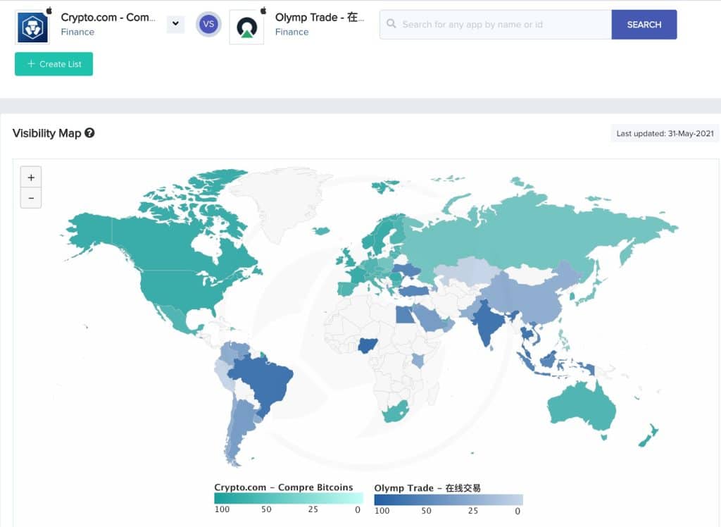
If we look at their visibility report, we can see that this seems to have been achieved. Both apps combined seem to be visible around most of the globe. Olymp Trade focusing on South America, Asia, and the surrounding regions.
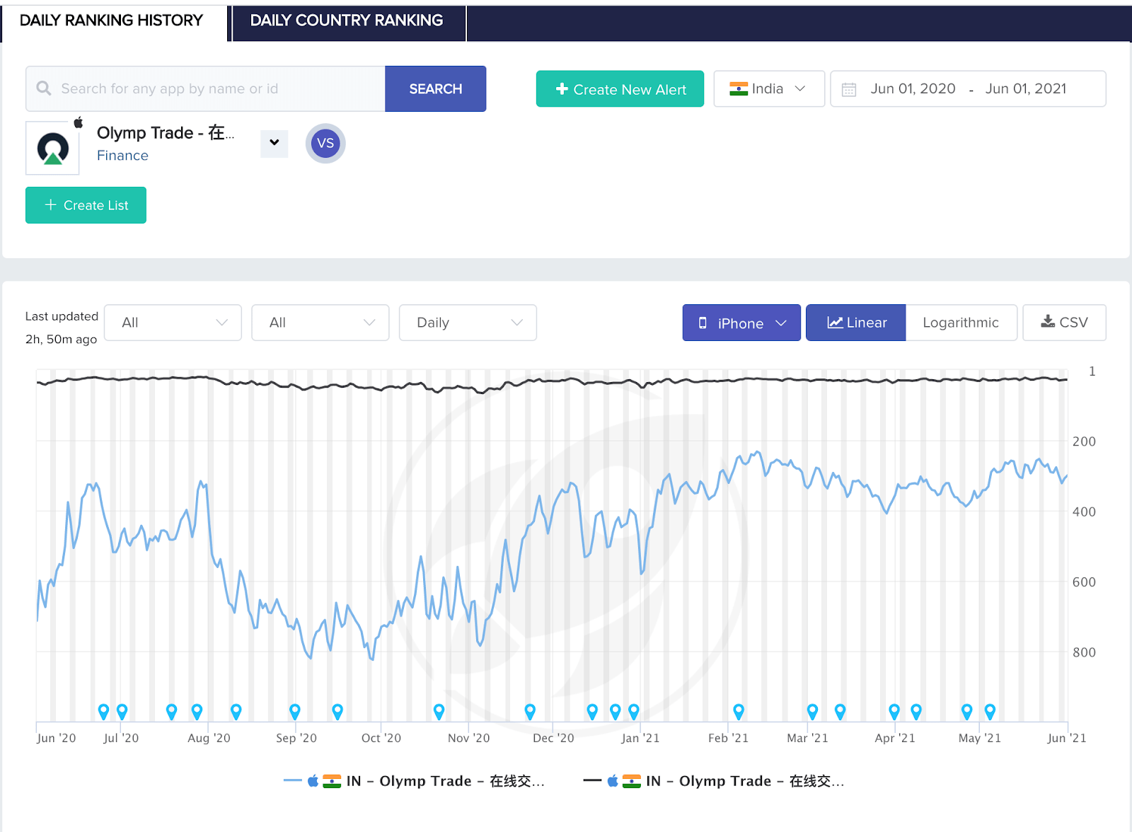
If we look at their category rankings over the past year in India, it appears that their campaign is going well. They did experience a low from August to November of last year in terms of overall, but have since climbed back up. Within their own category they are maintaining a pretty even rank.
Creative Breakdown:
There are two main categories of creative aesthetics for this app.
Serious creatives:
Using Mobile Action’s Mobile Ad Library, we can see that the Creatives for this App are
These creatives are very similar. They show the lifestyle that people investing in stocks may be hoping to achieve. They are targeted towards a male and female audience respectively, and show basically the same thing, aside from the fact that the woman-centric ad focuses more on the sightseeing and social media sharing aspect of travel while the creative oriented towards male audiences focuses on the travel itself. Showing shots of an airport, a plane ride, and an office with a big window and a view.
Overlaid across these scenes, are screenshots of the app demonstrating that you can use this app anywhere at any time and that it will translate to a luxurious and happy lifestyle.
This is different from many of the creatives that we have seen in the Top Advertisers category. This is because a finance app is meant to be used as a tool that enhances your experience of the real world instead of an escape from this world.
Playful creatives:
The next creative is very different from the previous two. This creative is clearly made to serve a very different demographic of users. The approach is one of comedy, and absurdity, but it also points to the playful aspect of stock trading.
To a certain extent, these apps do gamify the experience. This plays into that, gamification. It conveys the message that you can go from a novice to a pro with this app. The ad, while playful, makes you the promise that firstly, you will be able to make great financial gains. Secondly, you can do this using the app. Lastly, your gains will come with the ease of learning how to play a game.
Takeaways
This app’s strategy is to advertise in countries where it could see its competitors were not targeting. They are running multiples of their more serious creatives, perhaps as the first phase of A/B testing. They are running one playful creative with a few different iterations as well.
All in all, it appears that at this phase they are advertising aggressively with many small variations. This, in order to decipher what works best for them.
If you are interested in checking out their creatives and others in our Ad Library, make sure to sign up for a demo or use the free version of the MobileAction Ad Library.
