Making revenue by showing ads to users is one of the most popular monetization strategies among app publishers. Some users have a very negative attitude towards ads – they use adblocking solutions to block ads while browsing websites and using mobile apps. However, the majority of people understand that displaying ads makes it possible for publishers to keep the apps free, improve them, and not charge the users.
Nevertheless, it is important to provide high-quality user experience and not to interrupt people with intrusive ads. There is a lot of ad formats available – starting with small innocent banners and finishing with hated pop-ups. In this blog post, we will talk about interstitial ads and how to use them wisely so as not to make your users angry.
What are Mobile Interstitial Ads
You have definitely seen an ad that appears and covers some part of the page content. This was a pop-up. If you have seen an ad that covered the whole phone screen, you were dealing with an interstitial ad.
Interstitial Ads Definition
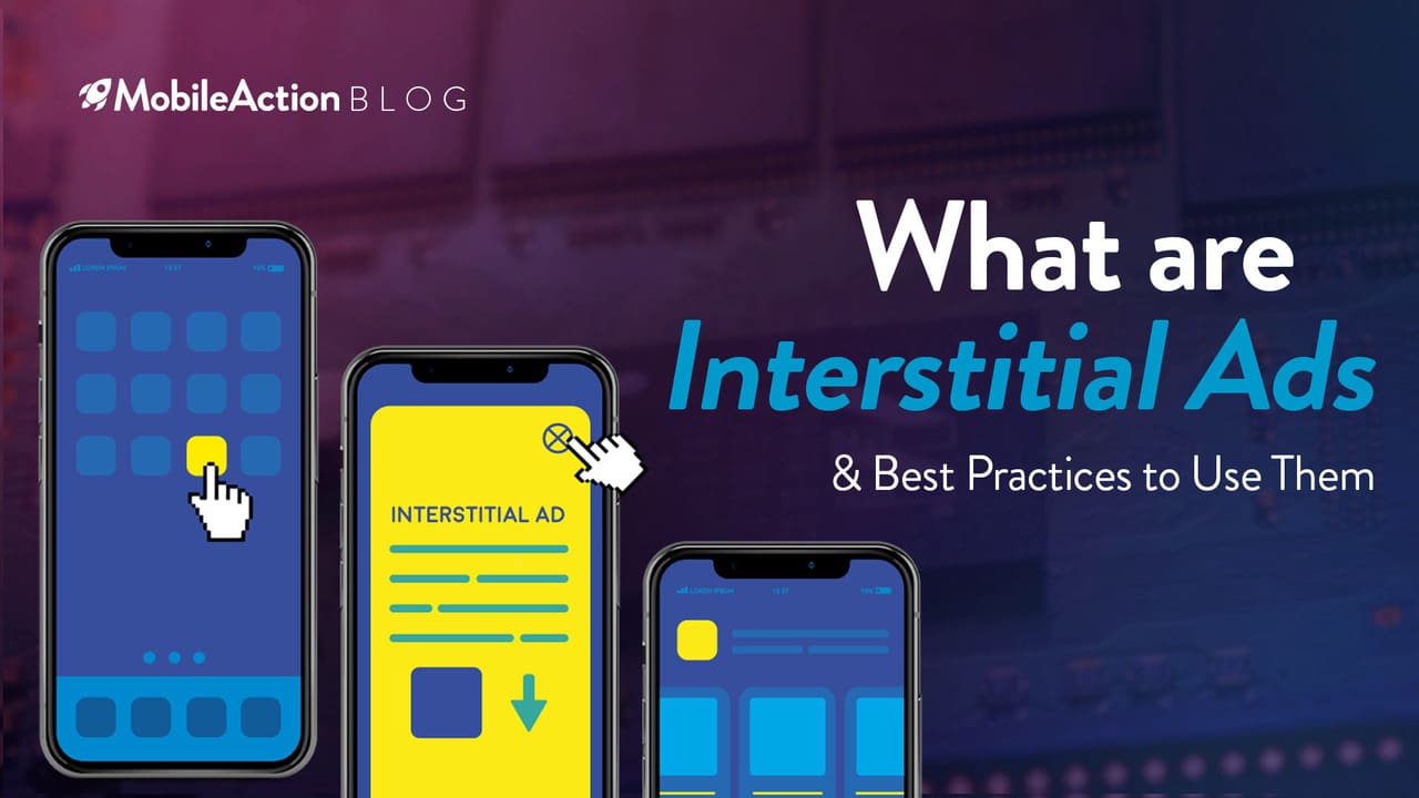
Interstitial ads are full-screen ads that cover the interface of an app or a mobile website page. While banners take some part of the space, interstitials cover the whole phone screen and make users interact with them.
When a user sees an interstitial, he or she either taps on the ad and is taken to the ad’s destination, or closes the ad and continues his activities within the application. Interstitials are considered more engaging than other ad formats because they offer a higher level of interaction with the users. On the other hand, they may be considered more intrusive and lead to a decrease in retention.
Interstitial mobile ads are supposed to act as transition points between different types of content or between different types of user activity within an app or on the website. They can appear in various formats: it can be a simple static image; it can also incorporate rich media, such as video.
If showing ads is a part of your monetization strategy, you can try integrating interstitials into your app. It is possible to show such a type of ads in both Android and iOS apps. Mobile advertising and revenue platforms, such as AdMob or Mobub, offer SDKs for Android and iOS and share specific guidelines on how to incorporate interstitials to your app.
How Should Interstitial Banner Be
Back in 2016, lots of app publishers were trying to incline users to download their native apps – they promoted the apps on mobile websites with interstitial ads.
Some companies reported that their app install interstitial ads have shown great results. By optimizing interstitials in 2016, Pinterest managed to increase downloads by 100%, and Airbnb – by 300%.
Google also did an experiment with an app install interstitial ads. They tried this ad format to drive downloads of the Google+ app.
Users who were visiting Google+ mobile website were shown an interstitial motivating to download the Google+ app. Although the ad has shown 9% CTR, 69% of visitors abandoned the website which was quite disturbing.
Then, Google launched a Smart App Banner to keep promoting their app but in a less intrusive way. While the iOS app installs were not affected, 1-day active users on the mobile site grew by 17%.
After such results, Google decided to refrain from using interstitial formats and appealed to other advertisers to do the same. “Let’s remove friction and make the mobile web more useful and usable!”, wrote David Morell, Software Engineer at Google+.
If you have an app idea, don’t forget to check out our new blog post! If you want to sell it in the future, “How to Sell an App Idea” content would be the best for you.
They Created Their Own “Don’ts” Lists
Listing common mistakes in their Search Guide, Google recommends avoiding interstitial ads, including native app download interstitials.
Putting intrusive interstitial app install ads “can cause indexing issues, and disrupt the visitor’s usage of the site.”
Instead, Google recommends promoting apps with simple banners that do not interfere with the content on the page.
In 2017, mobile advertisers were again alarmed with the new notion: Google started penalizing websites for showing intrusive pop-up ads by lowering their rankings in mobile search. Interstitials were often considered as such – annoying intrusive pop-ups that covered the page and interfered with user activities, making the content less accessible, and overall user experience – poorer.
Websites that continued showing them were no longer considered mobile-friendly. Google announced that “pages, where content is not easily accessible to a user on the transition from the mobile search results may not rank as highly.”
Although not all interstitials were considered intrusive, so some of them did not have an impact on the new Google algorithm, and their usage did not harm the rankings of the websites.
For example, an interstitial with a message about GDPR compliance, cookies usage and age verification would not hurt the ranking results according to the new algorithm. Login dialogs and banners that were easy to dismiss and didn’t use much space were also acceptable.
These Developments Have Changed the Mobile World
These changes to mobile search results were implemented in 2017 and had nothing to do with the interstitial ads shown in apps – they affected the ads shown on the mobile web. But the new Google guidelines defined how interstitial banner ads should be – no matter whether on the website or inside the app. They should be unintrusive, not interfering with users’ experience and easy to dismiss.
If you decide to create an interstitial ad, try to utilize available space in the most efficient and creative manner. There is enough room to deliver the marketing message of your brand. A “neuroscience” study from MediaBrix and Neurons Inc. shows that 40% of interstitial viewers remember the product advertised and 49% understand the brand offer. However, remember to test your ad creatives to achieve the best possible result.
Be respectful of your users. Interstitials that are static images will have a close option from the very beginning. Don’t try to hide it. Research suggests that viewers of interstitial ads fixated 22% of the time looking for the X button. Don’t make it harder and irritate those 22% of users. Instead, think about how you can make your ad more interesting and engaging.
When trafficking interstitials, take into account that, unlike static ad sizes, the size of interstitial requests depends not only on an interstitial format request, but also on the screen size of the device requesting the ad. If you use Google Ad Manager to run advertising campaigns, your ads should be sized as follows:
- 1024×768 or 768×1024 for tablets
- 320×480 or 480×320 for mobile devices
If you are planning to create interstitial ads for your product, you can look for inspiration from these interstitial ads examples.
If you have an ipp idea, don’t forget to check our previous blog post. Thereafter if you want to make money with it, “how to sell my app idea” content will be best for you!
Best Interstitial Ads Examples
Mobile advertisers often turn to interstitial ads. Because of their size, interstitials make a larger impression on users than other ad formats leading to higher click-through and conversion rates. If you are planning a marketing campaign for your app, consider including interstitials to your ad formats.
Studies have shown that you should pick interstitials to promote games, social and entertainment apps. On Android, interstitials bring the best conversion for games (3.3%), while on iOS maximum conversion with interstitials was reached for social (2.72%) and entertainment (2.28%) apps.
What is Google Saying?
Google’s policy about interstitials on the mobile web is quite strict. So, should app developers avoid letting interstitials into their apps as well? Not at all! According to Google Ad Manager, interstitial ads within apps are perfect for brands as they provide plenty of space for storytelling.
They are in great demand by both performance and brand mobile advertisers. Because of their size, interstitials are also highly engaging ensuring good click-through rates and conversion. This makes them attractive to various advertisers, including premium brands.
Interstitials contribute to increasing ad diversity. If you want your brand to stand out and minimize the “banner blindness” effect, you can test this ad format creating a static or rich media interstitial.
AdMob, Google’s ad revenue platform for app publishers, has guidelines for app publishers about incorporating interstitials in the apps.
Which apps are best suited to integrate interstitial ads?
It is recommended to integrate interstitial ads for apps with linear experience. There should be starting and stopping points in the app, and the ad can be implemented between the levels, stages or types of content. A good example is a game with several stages or a language learning app with different levels.
Where exactly can interstitial ads be placed?
If you have a game that has several levels or stages, an interstitial can be placed between them. This break will be quite natural for a player, the game will not be interrupted and he/she will have an opportunity to make a decision regarding the ad shown.
If your app is not a game and consists of many sections or pages, you can place interstitials after a user viewed a number of pages or performed several actions.
If your app requires lots of tapping on the screen (games often have that quality), it is recommended to take a pause before showing an interstitial ad. During this delay, you can show “Loading” or “Please wait” message. It will give a user some time to stop clicking, thus avoiding accidental clicks.
It is also recommended to place interstitial ads before the break page. A break page is a screen with a “Next” or “Continue” or “Back” button on it that a user is supposed to tap on. If a user has several break pages when he keeps tapping on the “Next” button and interstitial appears after them, he can accidentally tap on it thinking it’s another page that requires to tap “Next”.
How often should you show interstitial ads?
Remember that your task is not to annoy the user. If you bother the user too often, you will lose him/her and the money you could have earned if you were not as intrusive. Don’t place an ad every single time a user makes an action within your app.
Keep in mind the carrier latency
You can have an intention to show your ad between some content, but due to carrier network latency, your ad might show up a little bit later, when the new page has loaded. Latency is measured in milliseconds; it defines how long it takes for a source (network carrier) to send the packet of data to a receiver (in our case – mobile device user). AdMob recommends to take into account potential ad latency: “Carrier network latency can potentially affect delivery of interstitial ads in your mobile app. This latency may cause the ad to appear on the user’s screen at inopportune or unintended times.” To avoid this situation, it is recommended to preload your interstitial in advance. Make sure to follow AdMob’s developer guidelines for Android and iOS.
What is not allowed in Google interstitial ads?
AdMob also provides examples of interstitials implementation that are not allowed. We recommend adhering to AdMob policies. If you don’t comply with their restrictions without permission from Google, AdMob can stop serving ads to your app and even disable your AdMob account.
- Don’t place ads on app load and exit
It is not allowed to show interstitial ads before an app is loaded. However, placing an ad after loading is acceptable.
You also shouldn’t place an ad when a user is ready to close an app. Remember that it is recommended to put ads between content sections, levels or stages.
- Avoid placing interstitials if your app is running in the background.
A user should clearly understand which app is showing ads. It is restricted to place interstitials in apps that run in the background or outside of the app environment.
- Don’t show ads too often.
Don’t annoy your users and don’t repeat your interstitials too often. Showing several ads in a row is not a good practice.
Showing interstitials too often can result in navigation problems, which is also not good.
It is recommended to put not more than one interstitial ad after every two user actions within an app. Although this might also be too much for your users, so keep an eye on your retention rate.
- Don’t disappoint your users with a sudden ad launch
Imagine that a user is playing an exciting game and, unexpectedly, an interstitial pops up. Firstly, it will greatly irritate your user. Secondly, it may cause accidental clicks, which will upset the user even more. Wait until the logical pause between the levels of your game or content pages of your app – the user will be done with the app activities and ready to engage with your ad in a proper way.
An Example from Forbes
It might come to someone’s mind that companies that irresponsibly use interstitials are smaller businesses with a hunger for quick revenues and no respect for its users. However, there are big respected publishers who showed by their example what is wrong and what you should not do while monetizing your users.
Until recently, any time you clicked on the link leading to the Forbes article, you ended up not where you intended to be. Instead, you were greeted by a full-screen message similar to above.
“Quote of the Day” interstitial (or its predecessor “Thought of the Day”) displayed a quote of a well-known person with a purpose to draw attention to an ad placed close to the quote. There was hardly a person who found those interstitials interesting, or useful, or user-friendly.
New Developments Put Forbes at Risk
In 2017, Google announced that an updated version of Chrome would have a built-in feature blocking intrusive advertising. Google also released the Ad Experience Report, a tool that had screenshots and videos of intrusive advertising which helped to evaluate and score websites.
The tool was aimed to help publishers fix their sites before the launch of an updated Chrome version. The most intrusive ad experiences were identified by the Coalition for Better Ads. These were interstitials, autoplay video ads with sound, and flashing ads. Forbes was on the list of websites whose ads did not comply with The Better Ads Standards.
Apple also took a move against ad tracking preventing third parties from tracking users for more than 24 hours after a user visited a website. Publishers who relied on programmatic advertising were heavily affected.
All these changes put Forbes’ monetization strategy in danger. Having relied heavily on digital advertising and putting monetization in front of the user experience, Forbes littered its pages with auto-play video ads, interstitials and other types of advertising.
Now They Named “Disturbing”
Not only were ads annoying, but they also made users vulnerable in terms of security. At the beginning of 2015, it was reported that a famous “Thought of the Day” interstitial was compromised by Chinese hackers who targeted US defense and financial institutions using the annoying Forbes widget.
The hackers took advantage of the susceptibilities of Internet Explorer and Adobe Flash. Some number of visitors who faced the “Thought of the Day” widget was redirected to a different website where malware was installed on their computers. Forbes informed that the attack was noticed and stopped within 3 days.
In late 2017, Forbes started making progress. It got rid of an interstitial on mobile; the site-load time increased. Forbes was no longer on Google’s list of websites with “failing” ads. However, the story of the “Thought of the Day” interstitial will stay in the Forbes readers’ memories for a long time.
About Interstitial Video Ads
So far, we mostly covered static interstitial ads. However, this format can be more engaging while holding more enjoyable units like videos and playables.
According to Google, video interstitials “provide a high-value option for app monetization”. Cost per impression (CPM) for video is usually higher than for static formats.
The way video interstitials are placed in an app is the same as placing static interstitial ads – they should appear in front of the user between stages or levels during the pause point and not interrupt the user’s activity within an app.
For example, integrating an interstitial video ad in a game after a user completes a certain level could be a good idea. If a game has several levels, it means the user will have several breaks that can be organically used to display video interstitials.
One of the benefits of video interstitials is that they are dynamic, thus more engaging than static units. They will definitely not be overlooked like banner ads, because they are displayed full-screen and capture user’s attention more easily.
Try to Use Skippable Video Ads
Skippable video ads are the most demanded video interstitial option (although standard videos are also possible). They don’t annoy the users as they can skip the ad in 5 minutes. They are also beneficial to advertisers because they get to pay either if the video runs to the end or after 30 seconds (whichever happens first). The X button on such videos appears not from the beginning like in static ads, but after 5 seconds of playing.
Skippable ads also allow integrating the “Download” button. This type of interstitial is a good way for advertisers to grow app installs.
If as an app publisher you wish to serve video interstitials, make sure to follow Google’s requirement and integrate proper SDKs to your product.
Unfortunately, not all app developers follow the rules and best practices. Because of this, you can see articles in the media with headlines similar to this one “Interstitial ads are terrible and they need to disappear”.
The sad thing is that the lack of this knowledge (or maybe just the wish to get as much revenue as possible) causes users to uninstall the app. They may think that the product is bad and of low-quality just because they were interrupted too many times. Although, in fact, the product can be really good.
Interstitials, if implemented properly, can become a good source of revenue for app publishers. The large size of the ad gives plenty of space to convey the message most creatively and efficiently, which can help solve the banner blindness, achieve higher CTR and conversion rates.
Schedule a demo with us for more insights and to boost your app growth.