Downloads start with visibility but end with your creative assets. You optimize your keywords, increase your visibility and organic rankings in app stores. However, users will make their final decision by looking at your visuals. In this post, we are going to focus specifically on how you can boost your app downloads in Google Play Store utilizing screenshots.
Let’s begin.
First Thing First: Google Play Store Guidelines
As you know, Google has some rules and restrictions about your creative assets. The first thing we have to know is that we can add up to 8 screenshots per device type. Meaning that 8 each for phones, tablets, Android TVs and Wear OS watches.
These device types have different screen sizes and as a result, we face different size restrictions for screenshots. Therefore, before you create screenshots that skyrocket your conversion rates, make sure to check the guidelines for screenshots.
Screenshots Are Important
Even if you have the best app in your category, people only have a few seconds to decide if they should download your app or not. Therefore, if your app store listing looks bad, they will probably pass on your app and download one of your competitors.
In order to compete in crowded app stores, you need to make sure that every controllable aspect of your app appeals to your target audience. This means optimizing assets like your Google Play Store screenshots.
As mentioned above, users won’t download your app solely because they encounter your app in the search results. They will check your ratings and reviews, read your descriptions, and most importantly look at your creative assets. Why? Because users want to see what the app is about, how its user interface is, whether it’s the right app for their seeking or not. Your video previews and screenshots should aim to answer all of these questions in a direct way.
Now, let’s go step by step and master the screenshots.
How to Utilize Screenshots for Maximum Growth
Do not forget Your aim is not to demonstrate your or your UI Team’s artistic capabilities. Yes, screenshots must be visually engaging but the main point of them is to showcase your value propositions. Every aspect must contribute to your download numbers.
- Use all of the screenshot slots. Meaning, you should put all 8 screenshots to use.
- You have to bear in mind not all screenshots have the same value. Users will see them in order. That is why you have to list them in order of importance. The most significant value proposition must get the first place and the least, the last. Only then you can unleash the full potential of your screenshots.
- Keep it simple. Your screenshots should be self-explanatory. You might utilize some text and refer to different points while using an in-app screenshot. However, you should not overwhelm your visuals with too much text.
- Experiment with your screenshots until you find a consistent strategy. Give data collection enough time to reach realible and actionable insights.
- Not every market is the same. You should respond to the needs of your target users through localization. Go beyond
- When dealing with mobile growth, always keep in mind that the pace of change is faster than the rest of the technology world. A fact may become obsolete when you wake up the other day. Always stay in close contact with your subject matter.
Spotify Google Play Screenshot Study

Spotify is the most downloaded music app in the Google Play Store for the US. So let’s take a quick look at their screenshots by utilizing our App Intelligence tool.
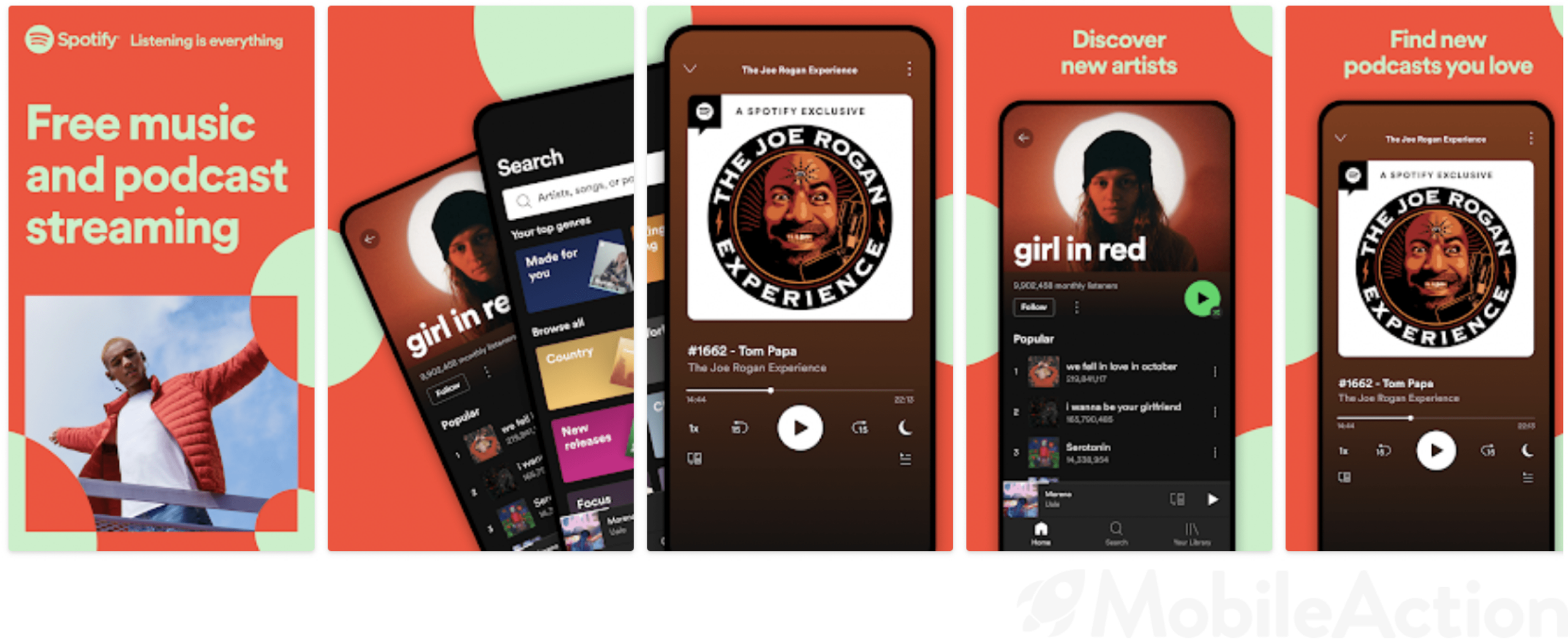
As they have somewhat recently integrated many more podcasts onto their platform, they show off on the first page that they are a streaming service for music and podcasts.
The next screenshot is meant to be displayed beside the first one, and then the viewer will have to swipe to see the rest. These subsequent screenshots focus on the features of the app. They keep the underlying colors and patterns from the first two in the background for the sake of unity but go into more detail about the apps’ features. This panoramic design also increases the likelihood that users will engage with your product page more, which increases the chances of an app download happening.
As you can see, Spotify is going with the color orange and light green. With this choice, they are giving their screenshots a fresh and modern look. Isn’t it a perfect fit for a music app that promises fresh music every week?
Moreover, the first three screenshots display many features of the app. How? It says “Free Music and Podcast Streaming” in the first and utilizes the second and third screenshots to show these features in the interface.
We see Joe Rogan’s podcast, the features of a customized playlist, and music browsing. They attract users with the first three and explain their value propositions afterward. As you can see, they don’t write essays but banners that are short and sharp.
The font of the text should also go with the design of your screenshots and reflects the tone of your app. Spotify utilizes a simpler font to explain their selling points. However, if you are promoting a hyper-casual game or a photo-editing app, for instance, you can try out some crazier fonts. All that matters is to sound and look the way you want your app to be perceived.

Google Play Screenshot Generator
If you are struggling to get started, there are quite a few sites that can help you generate screenshots.
Preview, for example, will let you completely build and customize your screenshots for the Play Store or the App Store. It will also let you test it for multiple devices. You can also have your graphic designer plan these out, but if you don’t have one as part of your still-growing team, a generator like this could be a good option.
Vertical or Horizontal Screenshots?
Cheap tricks or Competence?
“Why the heck do we care about whether my screenshots are horizontal or vertical? Is it going to make a difference anyway?” You know, they say that the whole is more than the sum of the parts.
Screenshots are an important part of your ASO efforts. If they are not complete, there will be no integrity in your work. Plus, often things you do in the User Acquisition department would look futile because their value is understood later on.
A vertical shot may let your users see a part of your other screenshot, but a horizontal one will cover the whole screenshot space. There is no absolute best practice about this.
If you want to demonstrate more than one aspect, at first sight, go for two vertical screenshots. If you have a nice video description for your app, you should use the video. For your ASO efforts, you have to take everything into consideration and this is one of its best examples.
What About App Previews?
There isn’t a benchmark for this question and the answer depends on the category of your app. If you are marketing a gaming app, video previews definitely maximize the click-through rates.
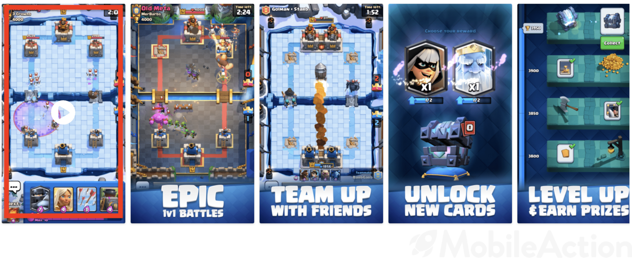
Above, we see the visual set of Clash Royale. They are utilizing a video preview to explain all aspects of their game in a catchier way. They could have presented only screenshots however, for a gaming app, users probably want to see how the gameplay is.
Isn’t this a better approach? We see how the battles take place, how to build our battle deck, and more. If your app has motions, motionless screenshots won’t be enough to fully transmit your selling points.
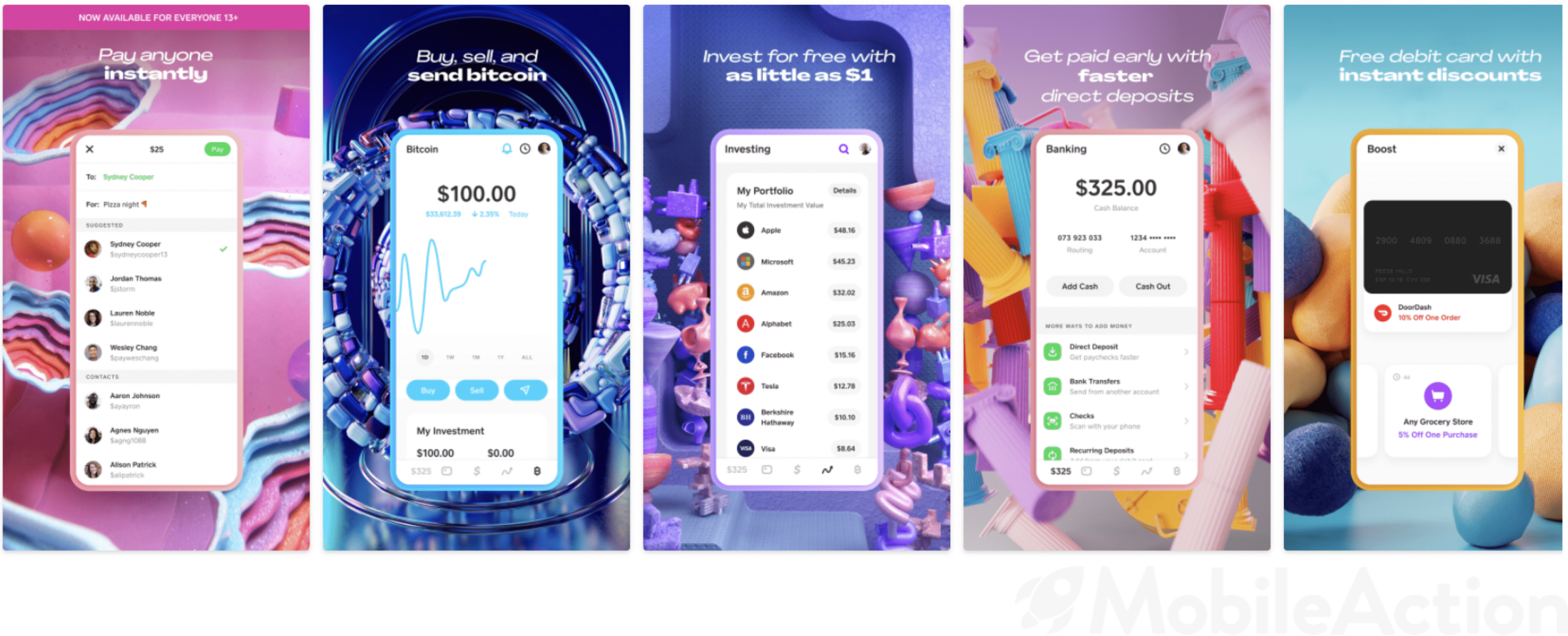
On the other hand, a finance app, for instance, might not need a video preview. As you can see below, Cash App does not utilize any video previews but explains its value propositions perfectly.
Key Takeaways
- Study Google’s marketing guidelines to avoid encountering a bad surprise.
- Use all of your slots.
- If you are a game developer, consider adding a gameplay video.
- Always put your winner shot first.
- Go for vertical screenshots unless you have a phenomenal horizontal shot.
- Make sure your app page complies with other elements of your brand
- Choose your Google Play Store screenshots so that they truly represent what your users are going to encounter.
Creative Asset optimization is of vital importance for increasing conversion rates and is a necessary aspect of Google Play Store ASO. With MobileAction’s mobile app intelligence tools, you can track your competitors, learn about marketing trends and improve your ASO game. Schedule a demo with our experts today to learn more.
