As MobileAction, we strive to provide you with the best user interface! September is packed with new features and product updates, and we’ll be keeping you updated about all the new stuff. So brace yourselves, blog posts are coming 🙂
Always wanted to see the creative counts and publisher counts of an app in a single glance? Oh, how you wished to see the breakdown of creatives and the usage of mobile ad networks in the same dashboard? Your wish has been heard loud and clear! Campaign Analysis section of our rising star, Ad Intelligence, got a really cool dashboard full of the most useful campaign metrics that you have been asking for.
Before we get into the details of this amazing update, just a quick reminder: If you have never tried our Ad Intelligence product before, you can always schedule a demo with us. Our team would be more than happy to have a chat with you and walk you through the whole product.
The Game Changer: Campaign Analysis Summary
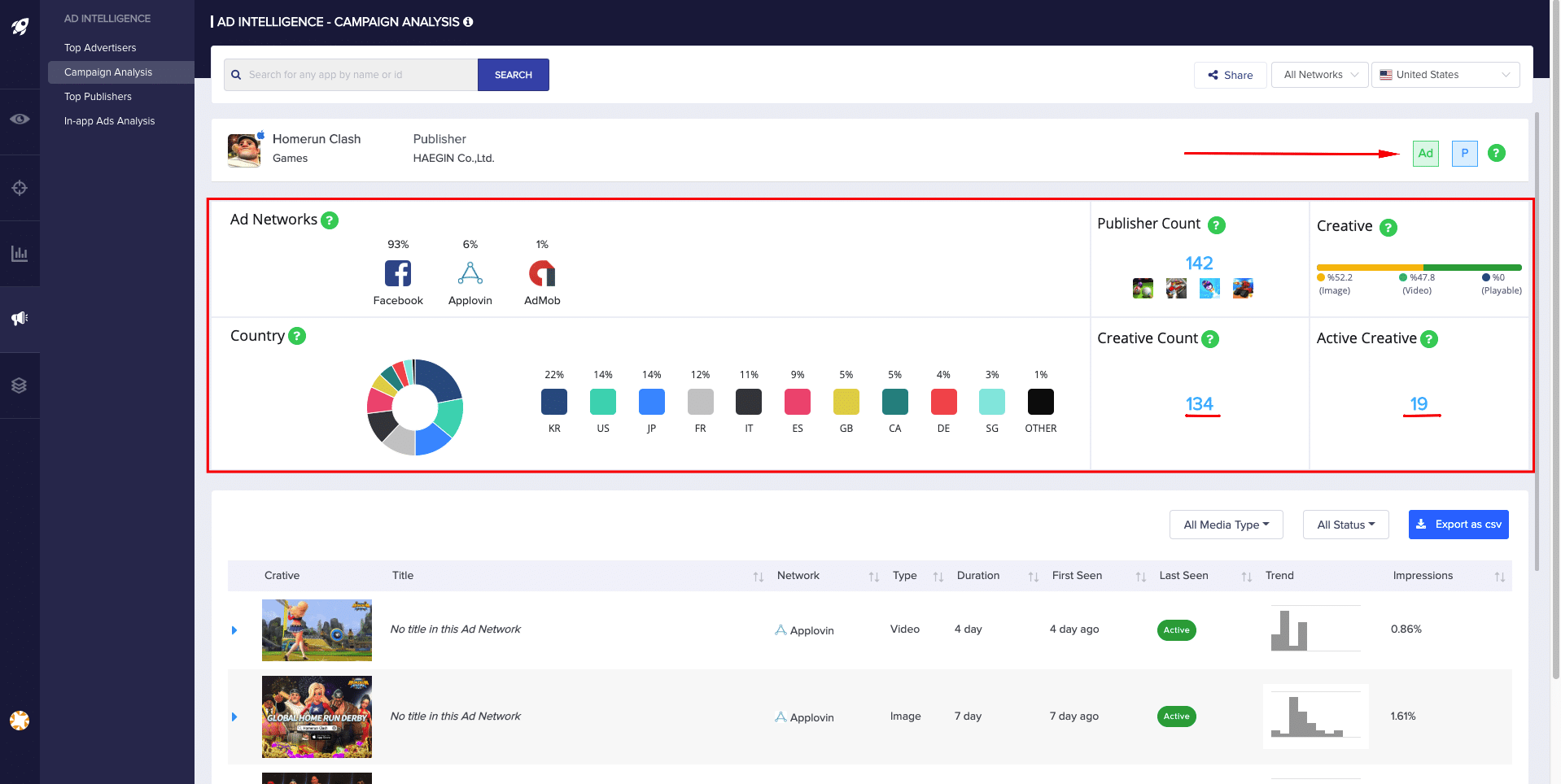
The new campaign analysis page gives you a quick summary of all the metrics of a selected app. No more hassles of trying to find out all the key insights one by one! Now, you can see the ad networks ordered from the most used to the least and the countries the selected app’s ads are available in. We tried to visualize the data as much as possible to make it more user friendly for you, so we used disk and bar charts in our new dashboard.
Ever confused about whether the app is running ads, publishing ads or doing both? Don’t fret over discovering that on your own! We’ve already given you a hand on the right corner of the new dashboard, “Ad” showing the app running ads and “P” publishing ads.
On the right-hand side, you can find all the KPIs you need to get insights about any app’s campaigns. Be it the “creative count” showing the total number of creatives the app used or the “active creative” indicating the number of creatives being used currently, all the quick data that will come in handy is presented in the best way. Would you also prefer to see the publisher count for a certain app? No worries! We got your back for that, too.
We know that you’ve always wanted to see a nice visual that shows the breakdown of the creatives based on their types. As we got lots of feedback about it from you, we made it happen. Now, you can see a snapshot of the types of creatives as a bar chart and quickly get insights about how an app is using creatives as a part of their ad strategy.
Filtering made easy!
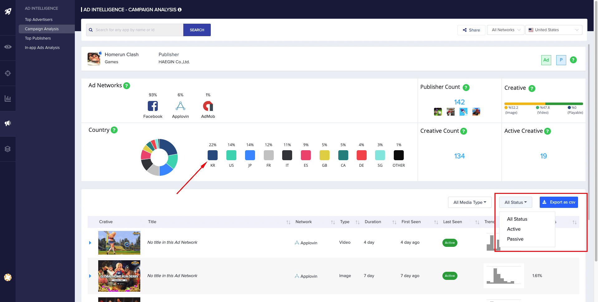
You already know that you can change the country from the drop-down menu on the top right corner. What if we told you that you can click on any country you want on the campaign analysis summary dashboard and go directly to the campaign analysis page for that country? You can also click any of the ad networks and filter the creatives published in that network only. Navigating through different markets has never been this easy! In addition to that, we have added a status filter into the creative part below in order for you to filter the ads based on their active or passive status.
With the newly revamped dashboard, you have everything you need to know for reporting and optimizing your ad strategy. Can’t wait to see the new Campaign Analysis dashboard? Schedule a demo with us!


